I started with a plain manila tag, colored with Broken China distress ink and a blending tool. I inked the tree stamp with Peeled Paint Distress Ink and spritzed it lightly with water before stamping over my blue background. After heat setting, I mixed up a little white acrylic paint with water and flicked it over the tag with a paintbrush to create a snowy effect.
The stag was stamped with Ranger's Potting Soil Archival Ink and coated with clear embossing powder while wet. After heat setting, I poured on additional embossing powder and heat set it again for a nice, smooth look.
I wanted to layer some papers behind the tag, so I chose a red plaid and cut it into a tag shape. The white paper with green dots is a Project Life journal tag which came printed with grid lines. I stamped the dots using Penny Black's Dots in Space stamp and Peeled Paint ink, then cut it into a tag shape. After punching holes in my homemade tags, I tied them behind my stamped tag using some dark red sheer ribbon.
The white panel behind the tags started as plain white cardstock. I used Ranger's Texture Paste through a Prima chevron stencil, then sprinkled some iridescent embossing powder over that. I let it sit for a few minutes and then heat set it.
The sentiment is inked with Potting Soil and embossed with clear powder. I colored the white cardstock with Aged Mahogany Distress Ink and a blending tool, and cut the banner shape by hand.
Everything was adhered to a dark brown cardstock base, cut to be a top folding card.
I'm linking this card up to two challenges: Winnie & Walter Playdate #4 and Muse Challenge #95. I pulled inspiration from both of these challenges to make my card. My colors I chose from the Winnie & Walter image:
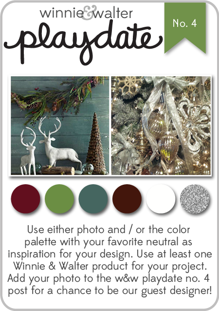 |
| Winnie & Walter Playdate #4 |
The idea of layered tags came from the Muse image:
 |
| Muse Challenge #95 |
I hope you have a great time this week, enjoying Thanksgiving with family and friends!
Immi